Context
The Challenge
The U.S. is the world's second-largest and fastest-growing whisky market. American consumers have shown growing openness to non-traditional whisky origins—Japanese single malts being the clearest example. Yet French single malt, despite domestic momentum, has almost no U.S. presence.
For unfamiliar products, packaging is often the first and only touchpoint. But there's no established visual playbook for French whisky in America. What design cues signal quality? What repels? This research provides answers.
Background
What We Know About Packaging & Preference
- Packaging is the "silent salesman." For unfamiliar brands, it's often the first and only touchpoint—communicating quality, authenticity, and brand personality before any product experience.
- Simplicity signals authenticity—but only for unknown brands. Research shows that clean, simple designs boost perceptions of brand authenticity, but this effect disappears once consumers are already familiar with a brand.
- Consumers evaluate packaging as a whole, not as parts. Color, typography, shape, and imagery interact in ways that isolated attribute testing misses. A gold foil accent that conveys luxury on a dark label may appear gaudy on a white background.
- Aesthetic preferences are learned and culturally coded. What reads as "premium" or "craft" depends on consumers' prior experience with category conventions—which is why unfamiliar-origin products face unique challenges.
- Traditional segmentation may miss design sensibilities. Consumers with identical demographics can respond to entirely different design vocabularies. Aesthetic preference operates as its own variable, independent of age, gender, or consumption frequency.
Methodology
What We Did
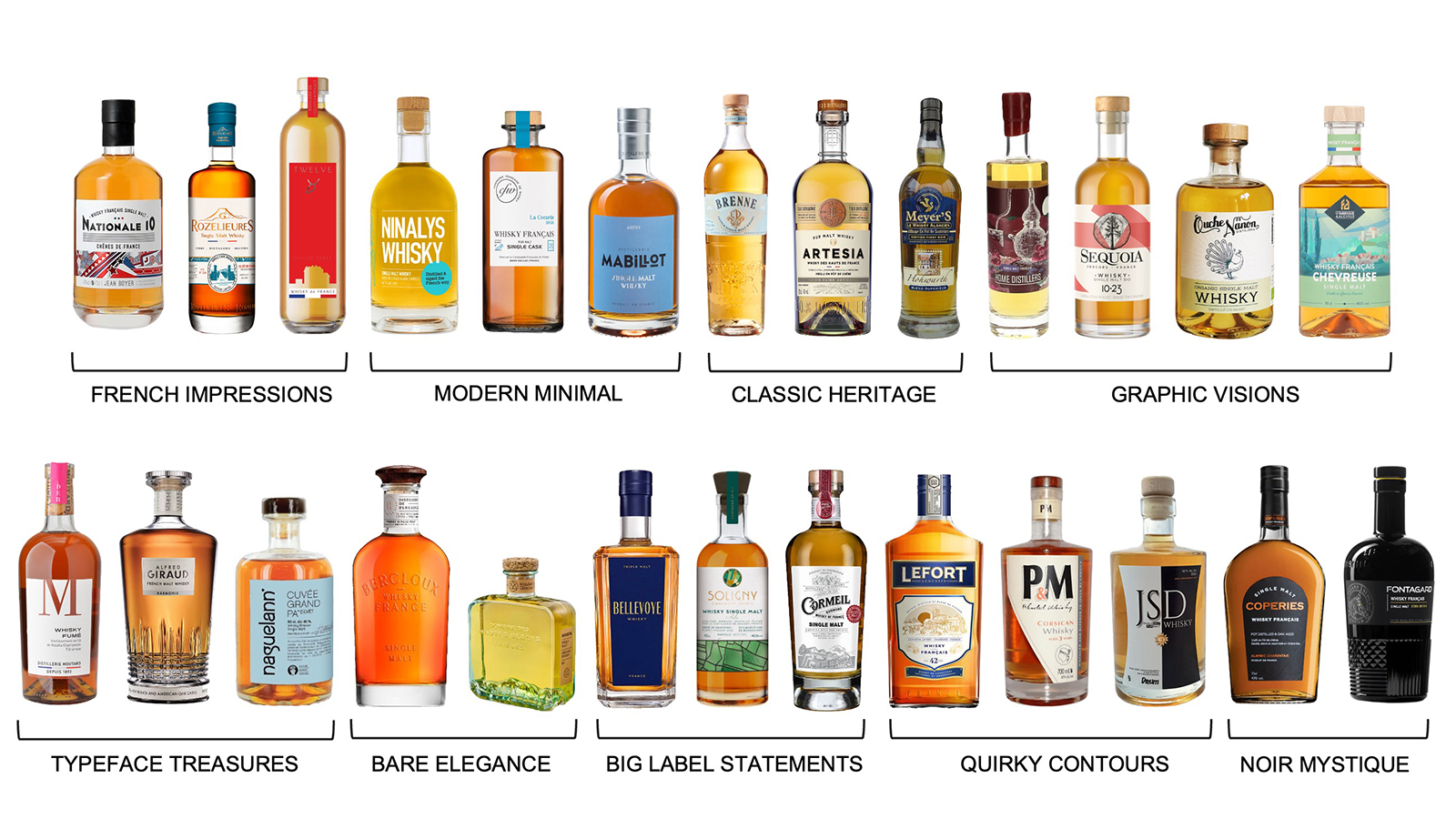
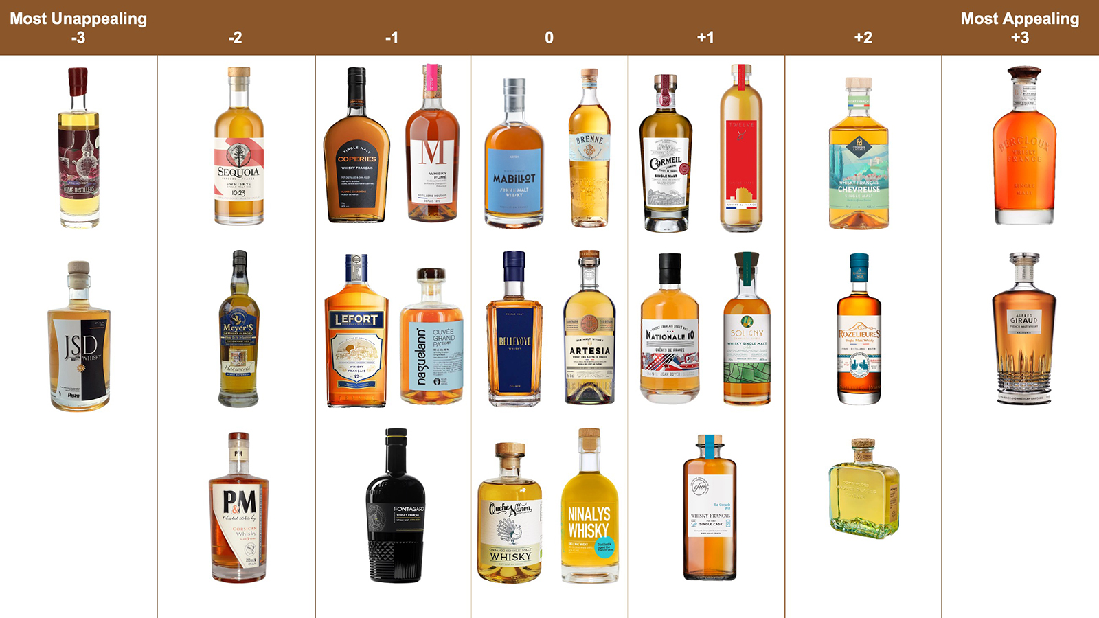
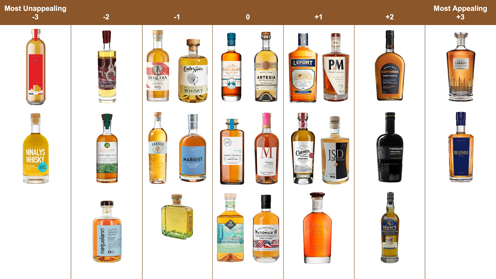
Using Q methodology—a technique designed to reveal patterns of subjective preference—we asked 26 U.S. adults to rank 26 French single malt bottle designs from most appealing to most unappealing. The bottles were selected to represent nine distinct design archetypes, from "Modern Minimal" and "Bare Elegance" to "Noir Mystique" and "French Impressions," ensuring visual diversity across the set. Rather than testing isolated attributes (color, font, shape), participants evaluated complete packages as consumers actually encounter them.
Factor analysis revealed three distinct consumer taste profiles, each with coherent aesthetic logic. These profiles cut across age, gender, and whisky-drinking frequency—suggesting that design preference operates as its own segmentation variable.
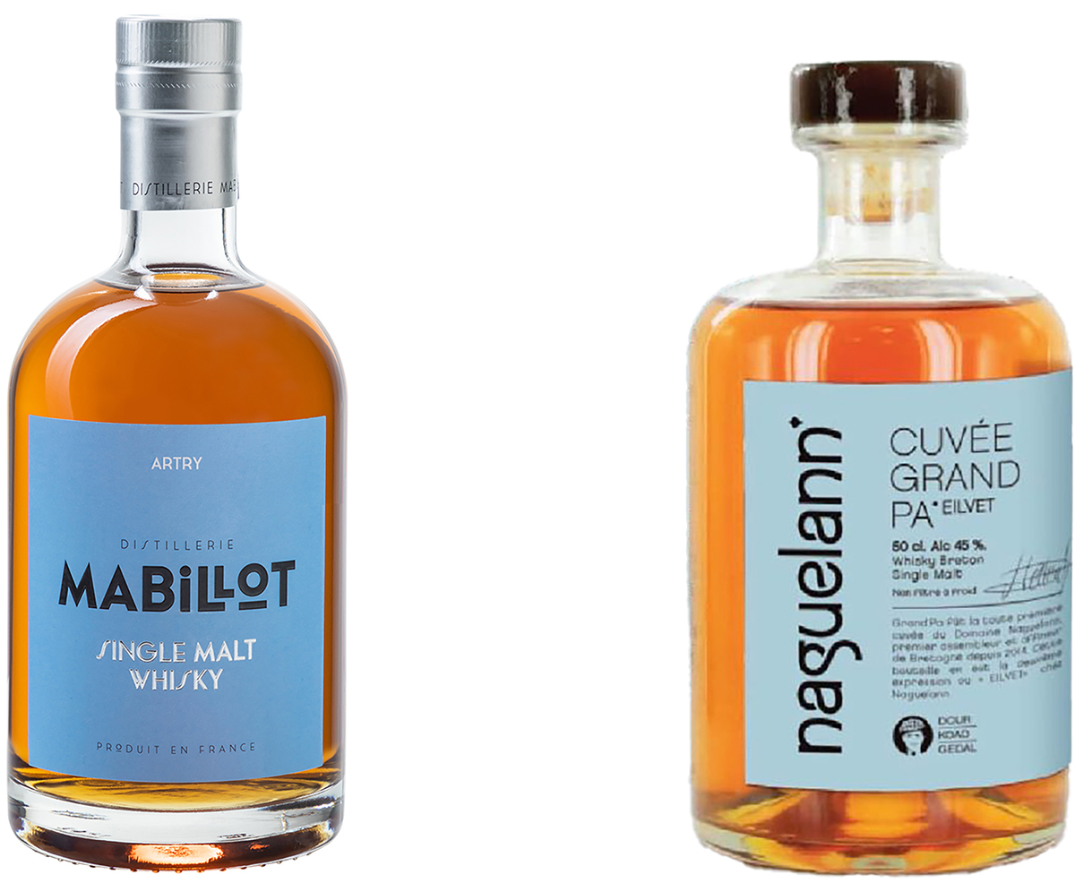
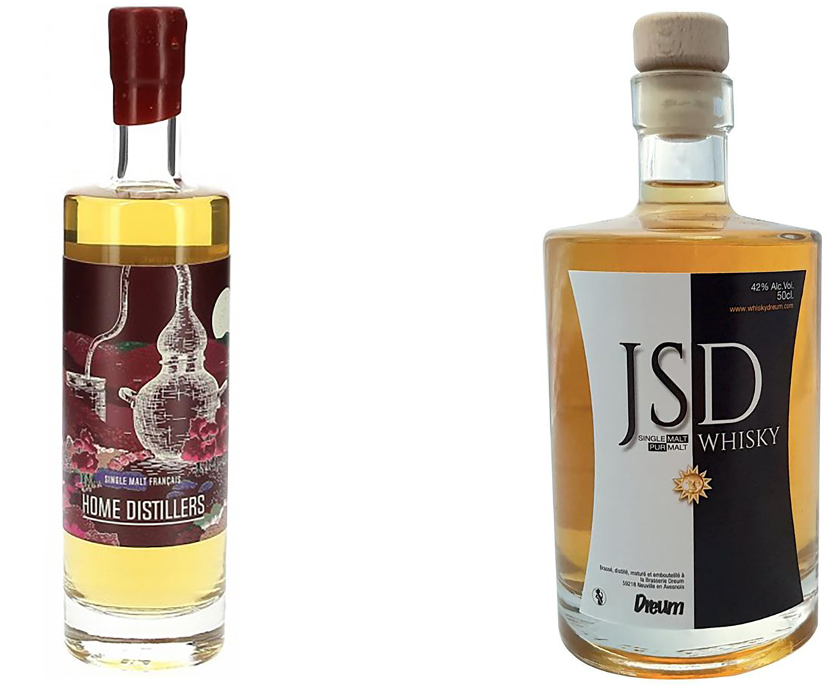
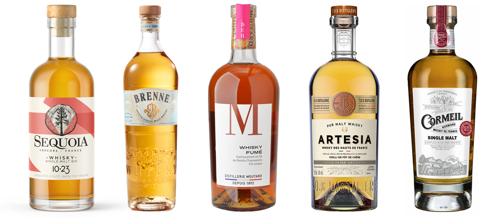
The 26-Bottles
Findings
Three Consumer Taste Profiles
The study identified three aesthetic viewpoints that are largely uncorrelated—meaning a design that strongly appeals to one group may leave others cold or actively repelled.
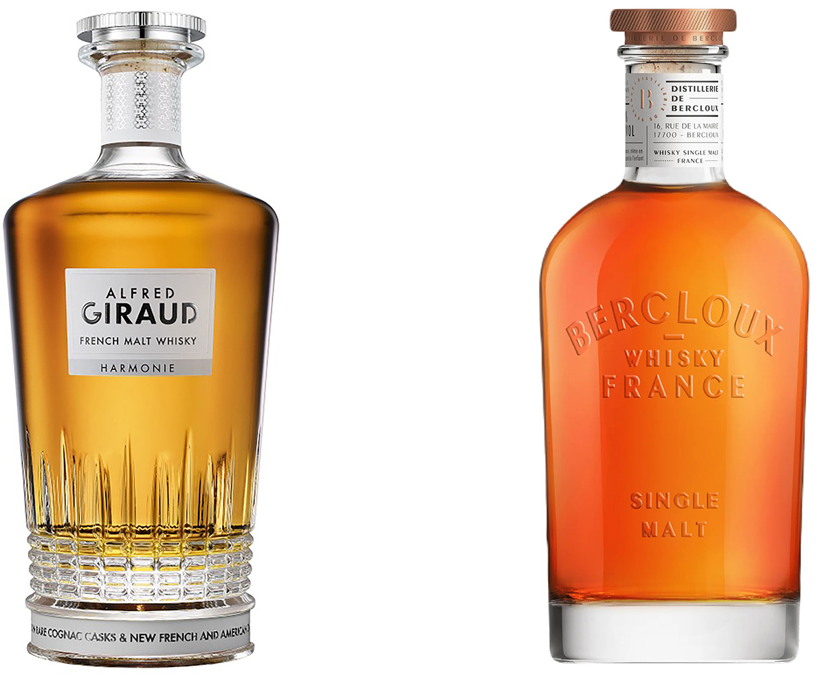
Factor A: Landscape & Provenance Appeal
These consumers want to see the spirit. They're drawn to bottles that signal place of origin and evoke rural craft traditions. Visible liquid, terroir imagery, and refined typography win; heavy labels and visual clutter lose.
Who loaded on this factor: Seven participants (six male, one female), median age 47, nearly evenly split among avid, casual, and non-whisky drinkers, with three working in creative industries.
Factor A Array
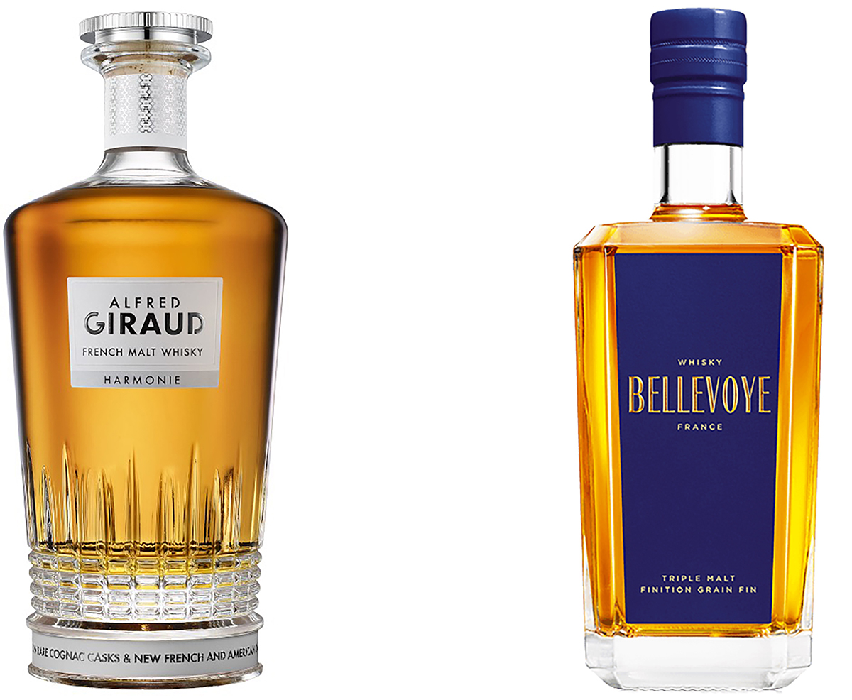
Top-Ranked Designs for Factor A
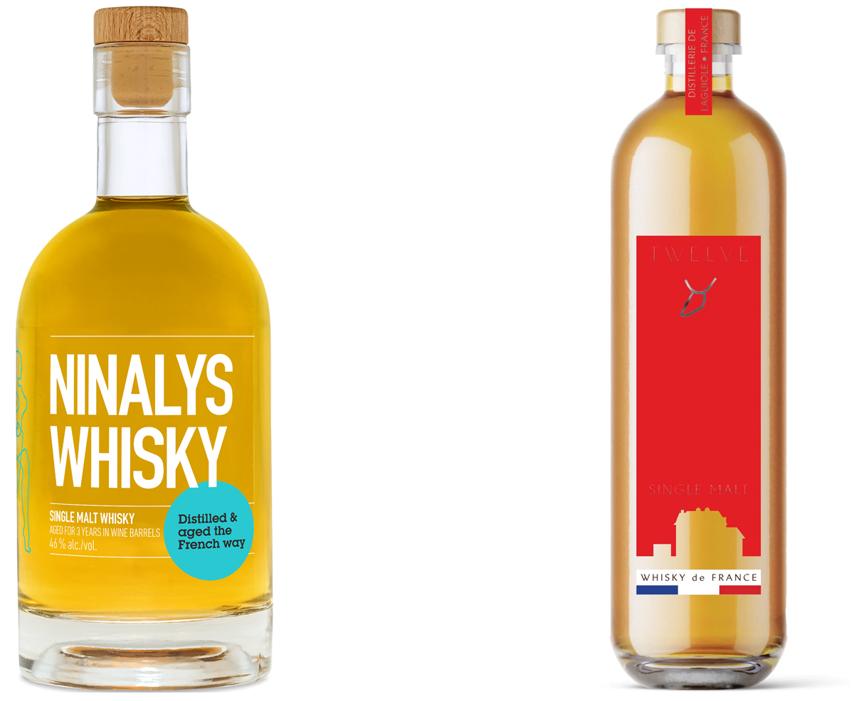
Lowest-Ranked Designs for Factor A
✓ Design cues to use
- Clear glass displaying liquid color
- Landscape or geographic iconography
- Refined serif typography
- Minimal label coverage
✗ Design cues to avoid
- Dark or opaque glass
- Die-cut or irregular labels
- Heavy illustration
- Full-wrap graphics
Factor B: Dark & Textured
This segment gravitates toward packaging that feels luxurious and tactile. Dark palettes, embossing, foil, and angular silhouettes signal premium quality. Bright colors, flat printing, and playful aesthetics read as downmarket.
Who loaded on this factor: Seven participants (six male, one female), median age 49, nearly evenly split among avid, casual, and non-whisky drinkers, with two working in creative industries.
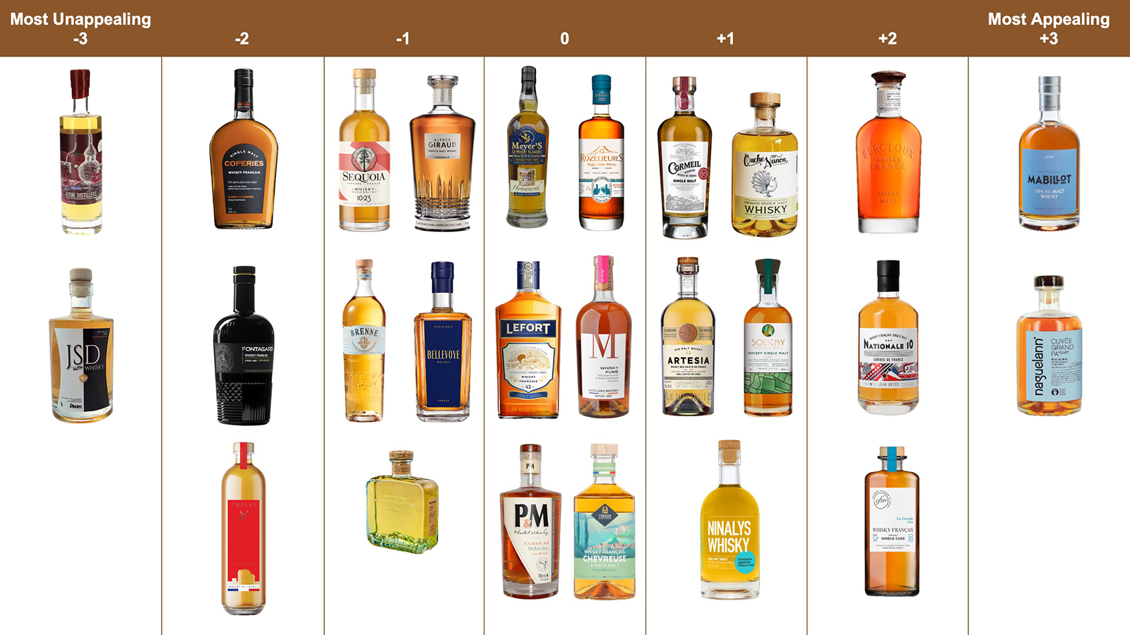
Factor B Array
Top-Ranked Designs for Factor B
Lowest-Ranked Designs for Factor B
✓ Design cues to use
- Dark glass or black label stock
- Emboss, deboss, or foil accents
- Angular bottle silhouettes
- Heavy paper, tactile finishes
✗ Design cues to avoid
- Bright or light color palettes
- Flat, unembellished printing
- Overt national symbolism
- Playful illustration
Factor C: Bold & Round Simplicity
The youngest-skewing segment prefers compact, rounded bottles with generous whitespace, bold color blocks, and clean sans-serif type. They see blank space as confident modern craft—not emptiness.
Who loaded on this factor: Seven participants (five male, two female), median age 34—the youngest of the three groups—with four of the ten non-whisky drinkers in the study and two working in creative industries.
Factor C Array
Top-Ranked Designs for Factor C
Lowest-Ranked Designs for Factor C
✓ Design cues to use
- Rounded or squat bottle forms
- Bold color blocks with whitespace
- Clean sans-serif typography
- Simple, geometric layouts
✗ Design cues to avoid
- Irregular or die-cut labels
- Dark, opaque bottles
- Busy illustrative treatments
- Overly traditional aesthetics
Consensus
What Everyone Agrees On
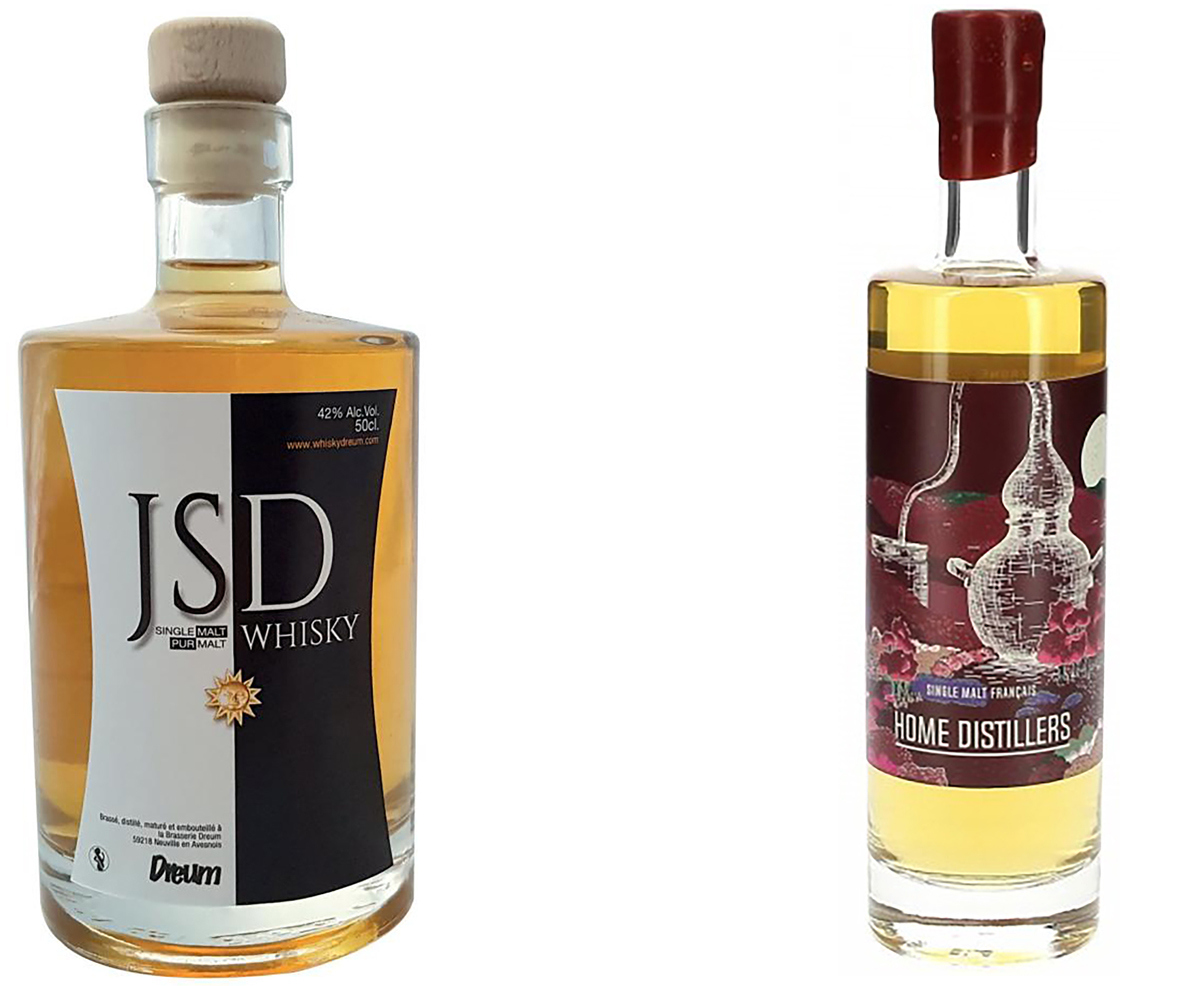
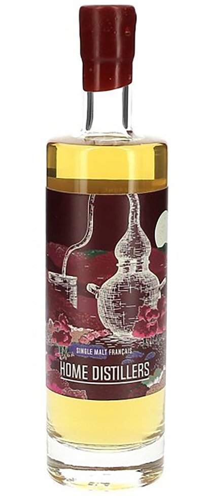
While the three profiles diverged on what they love, they converged on what they reject: heavy illustrative "craft-poster" aesthetics. The Home Distillers bottle—featuring a dense illustrated wrap—ranked at or near the bottom across all three groups. Participants described it as "visual clutter" and "too busy for a spirit that should feel timeless."
Consensus Rejection
Consensus-positive designs were rare and moderate. Cormeil achieved modest approval across all groups with a balanced aesthetic that neither offended minimalists nor thrilled texture devotees. The lesson: agreement emerges when a design avoids category-violation cues, not when it excels on any dimension.
Consensus Moderates
Unexpected Finding
Consumers Borrow from Other Categories
When explaining their rankings, participants frequently drew comparisons to products outside the whisky category entirely. This pattern suggests that when consumers confront an unfamiliar product—like French single malt—they don't evaluate packaging in isolation. Instead, they recruit mental models from familiar categories to make sense of what they're seeing.
- Bercloux was likened to Bulleit bourbon for its embossed, label-light aesthetic
- Domaine des Hautes Glaces was compared to a cologne bottle
- M was compared to a wine bottle
- Twelve was described as resembling a water bottle
- Coperies evoked maple syrup
- Compagnie Française de Whisky was described as medicinal
Designs that activated recognizable premium-spirits references benefited from borrowed credibility. Those that evoked non-spirits categories risked category confusion or diminished quality inferences. For French distillers, the implication is clear: packaging must speak the visual language of whisky—or at least premium spirits—before it can say anything else.
Implications
Strategic Takeaways
A consensus-friendly flagship (visible liquid, restrained labels, classic typography) can appeal broadly. Targeted line extensions can address segment-specific aesthetics.
Busy illustrative labels and irregular die-cuts risk alienating consumers who equate visual clutter with lower craft integrity.
Factor B's tactile cues (embossing, foil, paper weight) disappear on screens. For digital-first sales, photography emphasizing texture may partially compensate. Factors A and C translate well as thumbnails.
Dark noir aesthetics compel Factor B but may limit mass appeal. Treat strong polarizers as calculated bets, not defaults.
Design sensibility cuts across age, gender, and drinking frequency. Traditional segmentation may miss the visual psychographics that actually shape shelf choice.